HS&H
A full rebranding done for the Toronto
law firm for internal presentation.

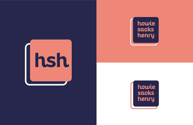
A custom monogram with an offsetting and interlacing rounded structure symbolizes the intertwined relationships involved between the firm and their clients. The font used, Altair Bold, is stable with soft and rounded characteristics similar to the structural boxes holding it together. The lower case exploration may be a bold move in terms of law tradition but it is a strong statement in showing that the partners and firm don’t hold their own interests ahead of others. It is key in outlining one of their top priorities, which is the clients needs come first.
Colours
They portray humanity, with some muscle. The navy blue represents the bold, powerful characteristics, illustrating a strong foundation. Peach comes in behind with an empathetic, calming environment, letting the viewer know a human touch is important as well.
BRAND MANIFESTO
The relationship between our heart and our head is a unique, powerful and stimulating one; giving us passion, knowledge and logic. How we handle or profession, clients and cases stems not only from an intellectual stand point, but also from emotional morals, allowinG our team to build on individualistic views. Our strength ensures stability as we remain pillars through trying times while our empathy solidifies the benevolence that keeps our compass pointing true north. We stand as a team with and for you, providing a leaning shoulder when needed and fighting until the last ring of the bell. As we join in unification, we are ready to put our hearts upon our sleeves and roll them all the way up, for compassion is our drive and fortitude is our device.


Background
BRAND DIRECTION

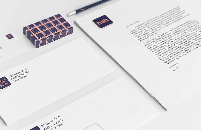
The custom pattern derives from the rounded shapes reminiscent of the intertwined relationships. This helps to establish the feeling of community as synonymous with the brand's values and morals.
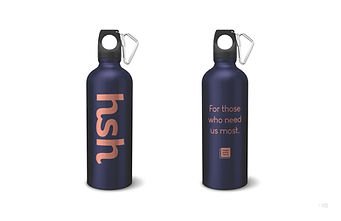
Physical Applications


Digital
Applications
WEBSITE MOCKUP

ONLINE BANNER AD


ONLINE BIG BOX AD
And, we kept having a little fun with it.
 |  |  |
|---|
